Map colors
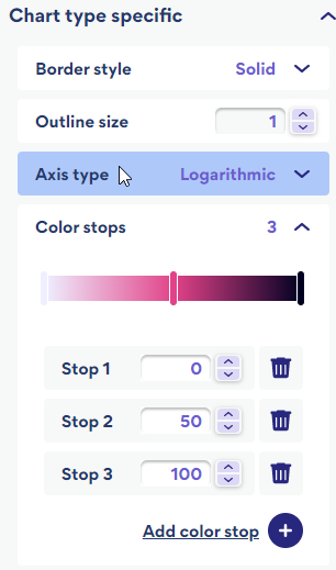
In the color stops control you can change the color palette for your map.
To open the color stops control
For a choropleth and categories maps go to Customize > Basic > Chart type specific

Understanding color stops
By default a map will have three stop points, each one with values of 0, 67 and 100. For a map with three stop points sliding stop 2 left makes it darker, and sliding it right makes it lighter. Drag the stop markers to align the colors with the data values.
Color stops show values on a scale from low to high represented by a color gradient. Colors are used to visualize patterns or variations in the values connected to geographical regions.
Typical color pallets:
Blend from one color to another


To achieve this:
- Add a stop
- Click the stop marker in the slider and select a color
Single hue progression

This is the default slider for choropleth and category maps.
Light to dark
To achieve this:
- Click the middle stop marker in the default slider to bring up the color picker
- Select a shade of gray or enter #808080
- Drag the stop marker to align the shade to the values
To add a color stop
There are two ways to add a color stop. Click anywhere on the slider and the stop gets added in that position. Or click Add color stop +. The stop gets added at position 100 in the slider. Click and drag it to the desired position.
Color stop ordering
Stops are ordered in terms of their placement along the slider. The stop on the left side of the slider is stop 1 ,the next stop to the right is stop 2 and so on.
Setting the map color
Click a stop in the slider to set the color for the gradient. This opens a color picker allowing you to pick a color, or you can add a hex code.
Delete a stop
Click the trash can next to the stop in the list.
What is the difference between the Choropleth and Category / Tile map?
The choropleth map uses a linear color gradient between the stops while Category / Tile maps assign specific colors within different ranges.
Tip: The color slider is reflected in the map legend.
