Column chart tips and tricks
Want to spruce up your column chart? Check out these common customization workflows.
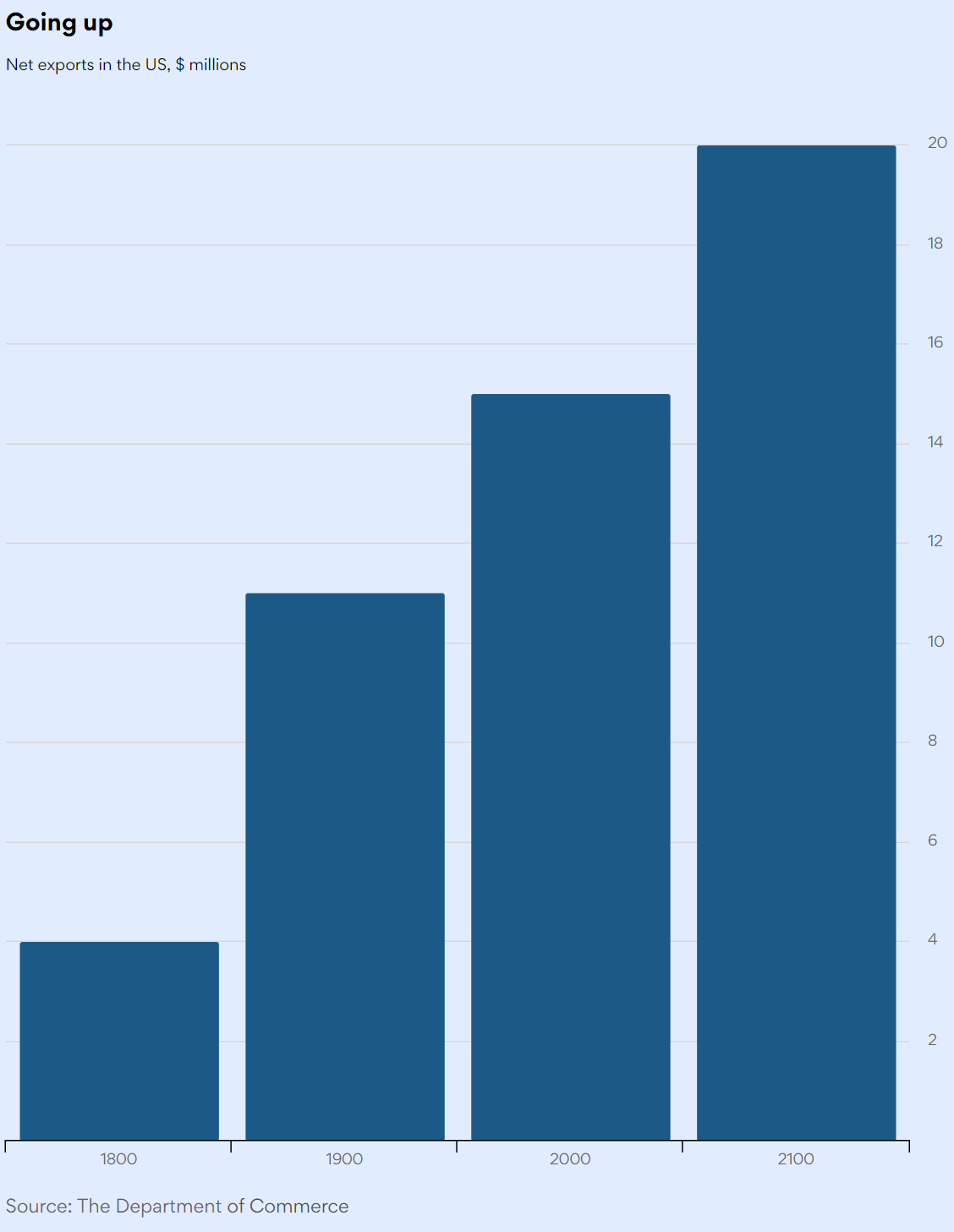
Add space between bars on a column chart
- Go to Customize > Advanced > Plot options > Column > Point width
- Enter a value to set the column width. The column chart above has a column width of '9'.
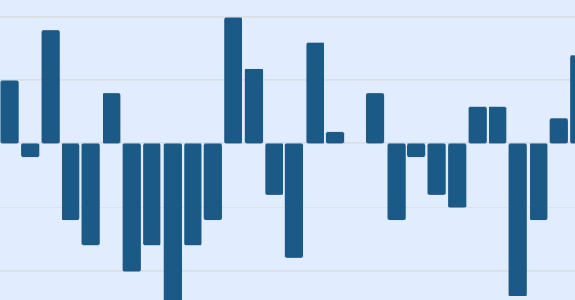
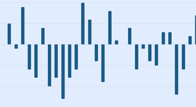
Accentuate the zero line in a chart
Highlight the zero line to help the reader distinguish between positive and negative values.
Go from this:
 To this:

To highlight the zero line in a chart:
- Go to Customize > Basic > Annotations
- Under Lines click +
- The plot area is highlighted. Click anywhere to start your line.
- Click and drag the white circle with a black outline to set the length of your line
-

- Drag the line to the 0 line
- Under Size select a value, e.g. 2 or 3, to set the line width

Hide 0 on the y axis
The first tick label in a y-axis is zero by default.
- Go to Customize > Advanced > Y Axis 1
- Set Show First Label to On to show the first label Off to hide it.
Create space on the plot area for a label
Extend the y-axis to add more space for annotations.
Go from this:

To this:
- Go to Customize > Advanced > Y Axis 1
- Turn End on click to On
- On Max padding click the up arrow to extend the y-axis
How do I assign a unique color to each column in a multi-column column chart?
By default, for a data set with multiple values, all columns will be assigned the same colour.
Go from this:

- Go to Basic > Chart type specific > and enable Color by point
- The company colors, which are listed in Appearance styles > Chart colors, are assigned to the columns if you are using themes.
Tip: Drag and drop the chart colors to assign different colors to the columns.
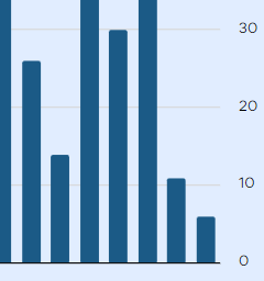
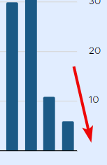
Adjust the number of labels on the y axis
The y axis labels is the text that show the categories or scaling of the axis. Sometimes it is desirable to reduce the amount of labels in an axis. The result, More space between labels results in less clutter and perhaps makes the chart easier to read.
Go from this:

To this:

- Go to Customize > Advanced > Y Axis 1 > Labels
- Next to Step, click the up and down arrows to set the desired amount of labels
Adjust the number of labels on the y axis
Go from this

To this:

- Go to Customize > Advanced > X Axis 1 > Labels
- Next to Step, click the up and down arrows to set the desired amount of labels
Add whitespace around the chart plot area and axes.
Go from this:

To this:

- Go to Customize > Advanced > Chart > Margin
- Adjust the margins with the up and down arrows for each part of the chart