Bar - chart type specific customization
Learn how to customize bars!
In "Chart type specific" you will get an overview of the series on your chart. You have the opportunity to adjust the series as you like. The series all have the same functions. In the following examples we will be customizing Series 1.

Series type
Series type lets you combine different ways of visualizing the series, within your chart. In the picture below the chosen type is the default value in this type of chart.

Series color
You have the option to choose grade of transparency, use HEX-code to find colors or use the color board to find the color you want for you series.

Negative values
This function uses color as a tool to differentiate between positive and negative values. Negative values will appear in the chosen color, which in the case of this example is red.

Color by point
Give each unique occurrence in the relevant series a unique color. These colors can be changed to a color of your choice by clicking Appearance styles --> Chart colors.

When ticking the box “Color by point”, each point in the relevant series displays in a unique color.
Border size
This feature allows you to expand the size of the borders around the bars in the relevant series. In the first example here Only the first series has a set border size. In the second example all three series are set to border size = 10.

Border color
Add color to the border!
Bar padding
Add padding around the bars. When adding padding in one of the series, it will automatically change the padding in the rest of the series as well.
Go from this: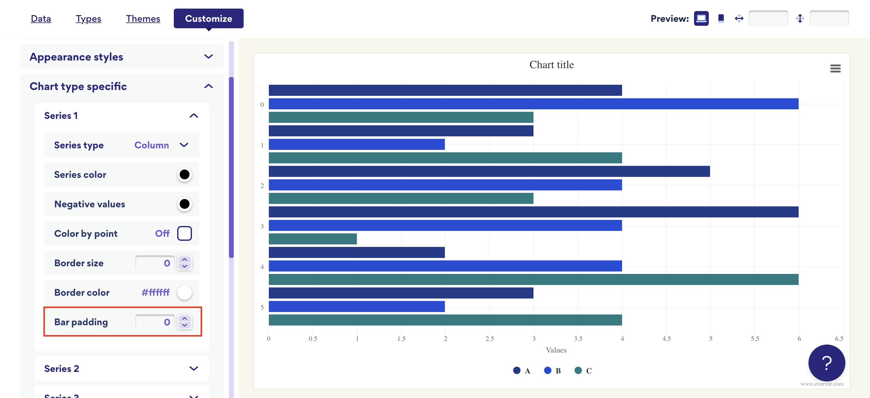
To this: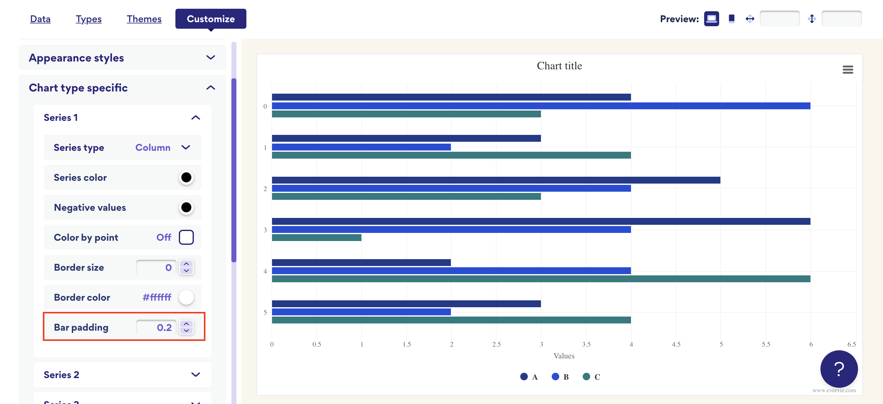
Add padding around the bars. When adding padding in one of the series, it will automatically change the padding in the rest of the series as well.
Go from this:
To this: