Create a combo chart
A combo chart or combination chart combines two column charts, two line graphs, or a column chart and a line graph into one.
In this article:
Introduction
In this article we will create a combo chart showing the relationship of energy used in a building vs. the temperature per day. As the data uses two different units we will add a second y axis for the temperature scale.
The end result will look similar to this:
Sample Data for this example can be found in this Google Spreadsheet
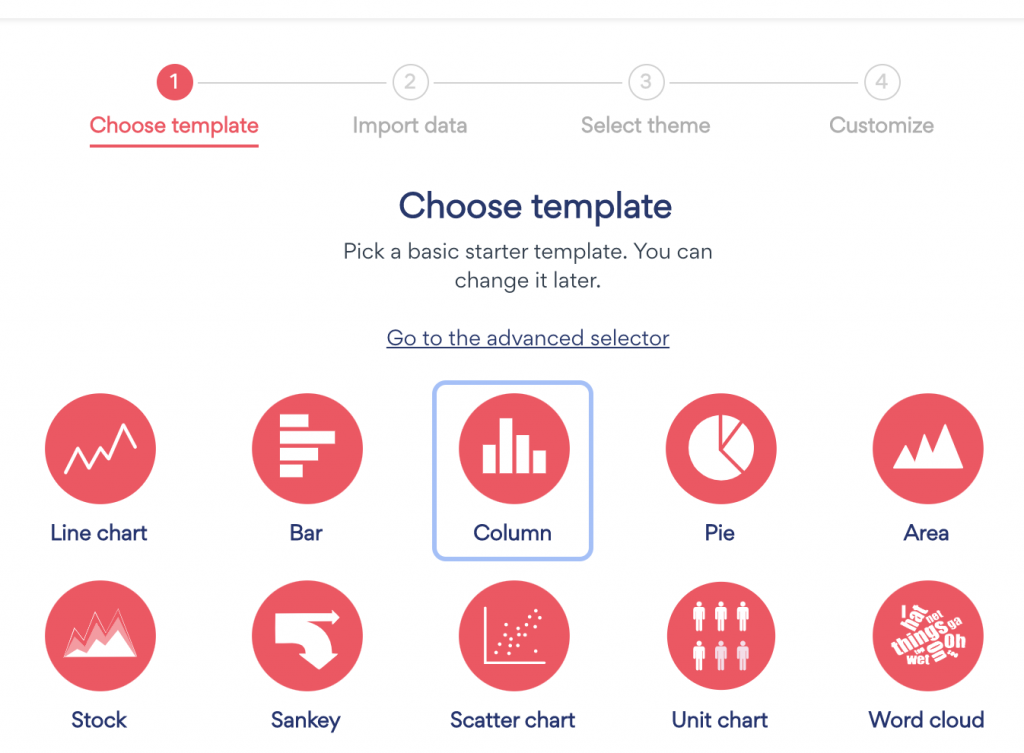
Step 1: Create project
Click on the Create project button, and choose Column chart
Step 2: Import data
Import your desired data, or use the sample data if you want to experiment with the data from this article
After importing data, follow the rest of the steps in the chart wizard.
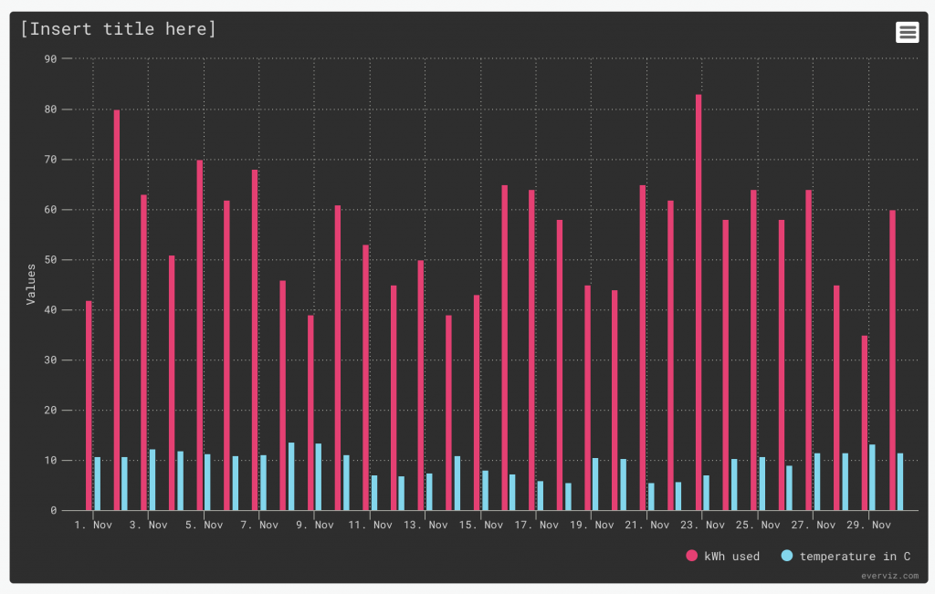
Our chart looks as follows after opening the editor. We chose the Monokai theme for this example:
Step 3: Create combo chart
Now you are ready to change one of the series from a column to a line
In the Editor on your left, choose the section "Chart Specific"
- In the first dropdown, choose the serie you want to change. In our case, Temperature
- Under series type, Choose Line or spline
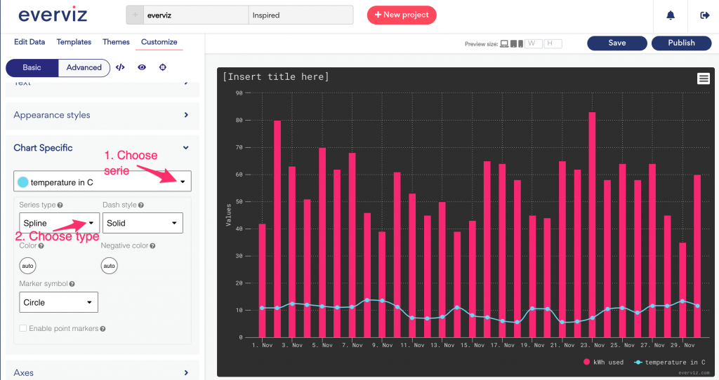
Now you have a combo chart containing of column and line.
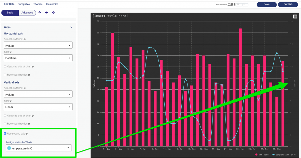
Step 4: Add a secondary Y axis
For the last step in this tutorial, we are going to create a second y axis for the temperature
In the editor, expand the Axes section. Scroll down and check "Use second axis"
In the dropdown below, you can choose which of the series that will be connected to your newly created axis
If you want to attach multiple series to your new axis, you currently have to do so in the advanced editor by setting yAxis of Series[n] to 1 (the count starts from zero, so your first axis is 0).
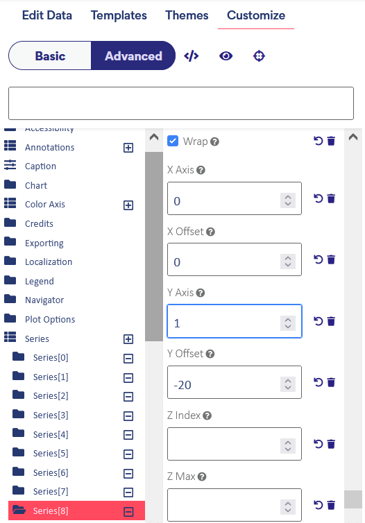
To find the right series you are looking for, find the title property in the Series[n], this will be the text that appears in your legend.
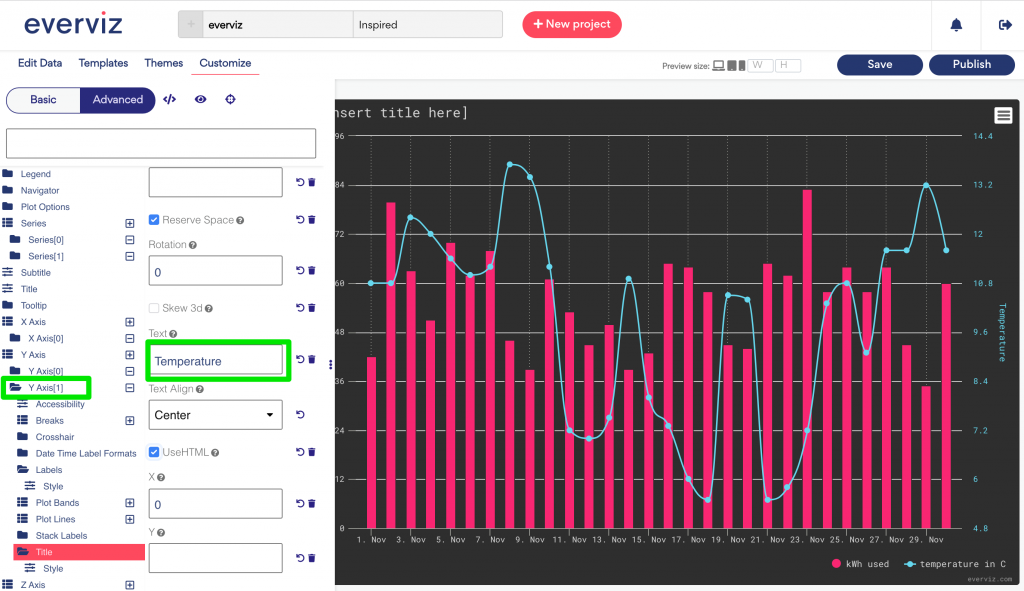
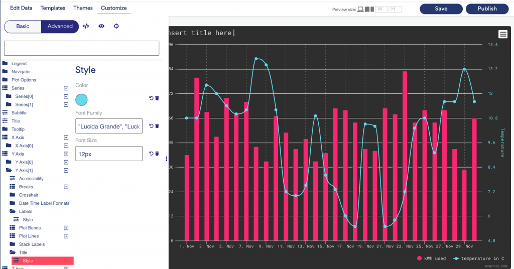
Step 5: Advanced customization for the second axis (optional)
If you would like to change the design for the second axis, you can go to the advanced editor
Open Advanced editor, and scroll down to Y axis > Y axis [1]. Here you will find many options you can use to design your chart
In the screenshots below we have shown where you can set a desired Y axis title, and colors.
Note that these setting can be built into a theme to make it easier next time you create a combo chart. Read more about themes here