Add forecast data as dotted line
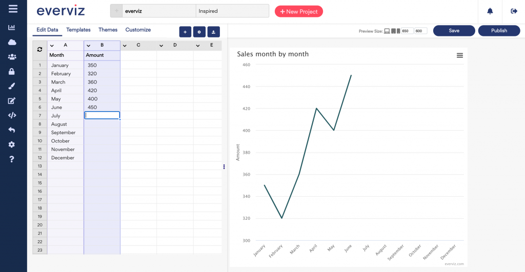
Let’s say you have created a line chart to display the sales amount in the first half year as in the screenshot shown here.
Now you want to forecast the sales amount in the second half of the year, adding the forecast values as a dotted line in the chart.
This article will introduce an easy solution to add a dotted forecast line in an existing line chart.
After completing this tutorial, this is how the chart will look like:
In this article:
Add forecast data
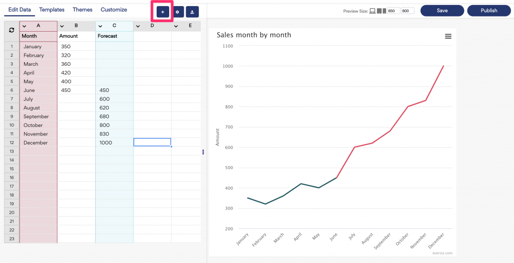
1. In the edit data tab, add a new data serie column, and list the forecast values as below screenshot shown.
2. Click on the "+" button at the top of the screen to add a new series.
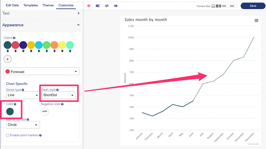
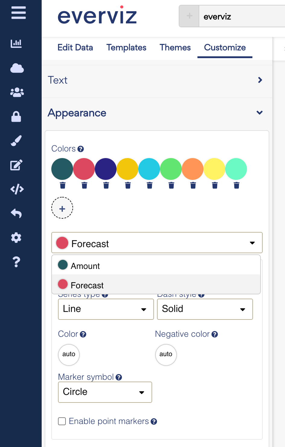
Customize the forecast line
You can customize the look and feel for the forecast line in the customize section.
1. Go to Chart type specific in the Basic Customize menu and select the Forecast series in the dropdown:
2. Pick a desired color and Dash style for your forecast line