Understanding axes
The x-axis and y-axis are shown by default in all charts containing data series with cartesian coordinate system. Here is a quick overview of the axis elements:
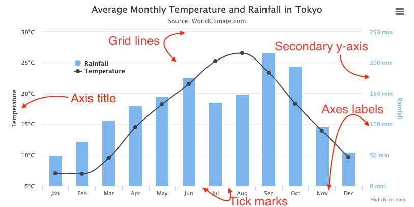
Axis labels, tickmarks and gridlines
The axis labels, tickmarks and gridlines are closely linked and all scale together. Their positioning is calculated to best fit the data present in a chart.
Ticks
Tick marks are the lines placed along an axis to show the units of measurement. The spacing between ticks are usually decided by the tick interval, which decides the interval of the tick marks in axis units. The tick interval does not have a default value on linear and datetime axes, and will attempt to do a best guess based on the data. However, On categorized axes, a null tick interval will default to 1, one category.
Note that datetime axes are based on milliseconds, so for example an interval of one day is expressed as 24h * 3600s * 1000ms.
The tick pixel interval option sets an approximate pixel interval of the tick marks based on a pixel value (if tick interval is not set to anything). This makes charts responsive, ensuring a reasonable distance between ticks regardless of the chart size and axis length. It doesn't apply to categorized axis. Defaults to 72 for the y-axis and 100 for the x-axis. Most users don't need to change this setting.
Minor ticks
If the minor tick interval option is set, minor ticks are laid out between the major ones. This includes minor tick marks, and minor grid lines, which have their own options for look and feel, but excludes labels.
Labels
The axis labels can be found along the axis showing the value of the data it corresponds to.
Axis types
An axis can be either, linear, categories, datetime or logarithmic. We don't often see logarithmic types, and most users can safely ignore it. A distinguishing feature of the choice of axis is their support for formatting and different ways by ticks are placed.
Linear
The numbers along the axis are of linear scale. This is the default axis type. If only y-values are present in a data series the x-axis is labeled from 0* to the number of y-values:
(*) Zero is chosen because of historical reasons, and has to do with how everviz understands the data. Starting at 0 is known as indexing.
Datetime
A datetime axis prints labels of round date values in appropriate intervals. Behind the scenes, everviz understands a datetime axis is a linear numeric axis based on milliseconds since midnight Jan 1, 1970. Depending on the scale the datetime label will either be represented as time or a date.
With stock charts the x-axis is always a datetime axis.Categories
Sometimes it is desirable to name the points of your data, in which case the category type is ideal. Such as often is the case in bar- or column- charts, as the amount of data points is limited and often named. This can even be the case where you want to explicitly name all twelve months, without thinking of them as dates.
Logarithmic
On a logarithmic axis the numbers along the axis increase logarithmically and the axis adjusts itself to the data series present in the chart.
Note that on logarithmic axes, the tick interval option is based on powers, so a tick interval of 1 means one tick on each of [0.1, 1, 10, ...]. A tick interval of 2 means a tick of [0.1, 10, 1000, ...]. A tick interval of 0.2 puts a tick on [0.1, 0.2, 0.4, 0.6, 0.8, 1, 2, 4, 6, 8, 10, ...].
Another thing to note is that a logarithmic axis can never become negative, as each full axis unit is one tenth of the previous. As a consequence, everviz will remove 0 or negative points associated to the axis.