Data panel in the editor
In this article:

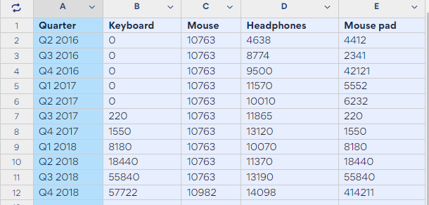
The data tab, one of the areas in everviz's editor.
The data panel is for working with chart values and series. It has three main elements:
- The chart controller
- The data grid
- The chart preview

If you have uploaded data and you are satisfied with it, then skip over the data tab to the customization options or publish your chart. But say you want to update a chart that was created a few months ago with fresh numbers. Then you would need to work in the data panel.
Working with the data panel
This example shows how the three elements in the data tab work together to produce a visualization.
In this workflow covers:
- Creating a new row in the data grid
- Adding a new column in the data grid
- Using the chart controller to assign a series
- Displaying a new series in the chart preview
Let's have a look at two common workflows involving a chart with sales numbers per product. Your chart is published on your website with Q1, Q2 and Q3 revenue figures for 2018. The Q4 numbers are ready and you want to add them to the chart.
Adding a row in the column grid
Click the cell under Q3 2028 and type Q4 2018 in the categories column. Then, add your figures per product in the corresponding cells. Use the arrow keys or the mouse to move to the next cell.

Adding a column in the data grid
Now say you want to add another product to the data grid. A webcam, your new product, will appear in Column F next to mouse pad in column E.
Start by adding a series by clicking the chevron icon in column D in the data grid.
 Then, click + Add column right.
An empty column appears. You can now add the sales numbers directly into the data grid. Start by adding a title to the series (webcam) and then add the values per quarter.
Notice the chart preview does not show the new series. This is because a series has not yet been assigned to column F. Assign a series to a column in the chart controller.
Assigning a series in the chart controller
In the chart controller, click + Add series.

Series 5, the new series, gets assigned to column F. Also notice the new series now appears in the chart preview.

Series options
The chart controller is packed with options for working with your chart data. It allows you to add labels to a series and add custom icons to your chart. You can also instruct the chart to fetch a data from a specific column.
Expanding a series in the chart controller exposes the following options:
- Value: for assigning a column to a series
- Label: for adding a text label next to data points in the chart
- Extras: for adding custom content to your chart or map.

Value
The value picker allows you to assign series values to specific columns. Building off the chart above, imagine the finance department reported updated sales numbers for headphones. The old numbers in column D are no longer valid, and the new sales figures must be added into the chart.
Start by adding a column. Click the chevron in column F and click + Add column right. Add the data into Column G.
In the chart controller, click Add series + to create series 6.
Now, in the chart controller, click Value for Series 3 - Column D and select Column G.

Column D values are now deactivated and the chart is now showing values in column G. Notice column D lost its blue highlight, meaning its values are not used in the chart.

Label
Adding text labels to the data points on a chart is great way to explain anomalies in the data, for example peaks or valleys in a trend line.

Here labels appear on a series visualized with a red line. Labels are added in a column in the data grid and assigned in the chart controller.
So let's add labels to a series in the chart, building off the product revenue chart we already created.
First, add a column by clicking the chevron in column G and selecting + Add column right.
Give the new column a title and add the text label to the appropriate cell.
In the chart controller, expand Series 3 - Column G Headphones (new data), Label and select Column H.

The label appears on the chart in the chart preview, highlighting a big boost in sales in Q1 2018.

Extras
Extras allow you to add custom content into your chart.
To use Extras, follow same workflow for Label and Value. First, create a column in the data grid. Add the data to the cells, as described in this use case where weather icons are added to a point map.
Add your own data
There are several ways to populate a chart with data. As in the workflows above update a chart with new data by typing it into the data grid. This is ideal when adding a limited amount of data, for example expanding your chart with a series or column.
But if your chart requires a completely new data set, use the options in the Add your own data panel to save time.
There are three data upload options.
- Paste - copy the data from a spreadsheet and paste it into the data grid
- Upload - upload a local file
- Link data - connect your chart to an external spreadsheet. Read more about the live data integration here.
Data panel FAQs
Q: Can I include characters other than numbers in my data grid? A: No, inserting certain characters such as the forward slash '/' will cause your chart to break upon publishing.