Data for the chart and table wizards
In step two, data, add your own data to the chart or table.
Tip: Use the example data included with each chart if you do not have your own data set.
Working with data
There three main areas for working with data:

- The chart controller: Options for organizing the data grid
- Data grid: Contains your data and mirrors the data structure in the original spreadsheet
- Chart preview: your data visualized with the chart type you selected in step 1
Tip: To see the relationship between the three areas, hover your mouse over a series in the chart controller. This will highlight the corresponding column in the data grid and series in the chart preview.
Note: See this article for a description of the options in this step, which mirror the options on the data panel in the editor.
Adding data to your chart
There are four ways to add your own data to the chart.
- Paste: Copy the values from your spreadsheet and paste them into the data grid.
- Upload: Upload a CSV file from your local drive
- Link data: Connect a chart directly to a spreadsheet
- Manual input: Type the values into the data grid
Chart data structure
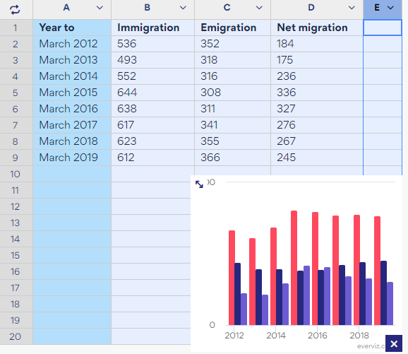
Data is the basis of all data visualizations. Data is organized in a spreadsheet in a so-called data structure. The data grid in everviz shares the data structure as in your original spreadsheet. It has the same number of columns and rows and the values are stored in the same cells.
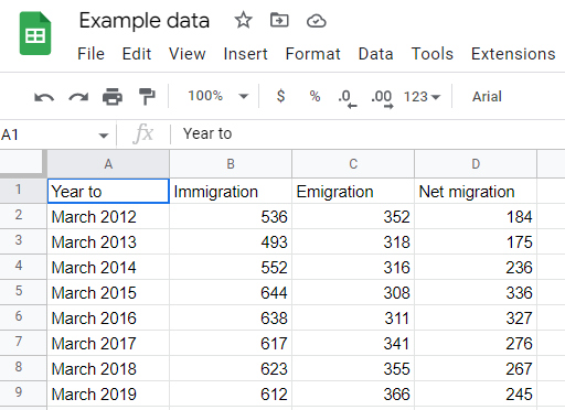
Data in Google Sheets:
 The same data in everviz:
everviz is unable to interpret spreadsheets with multiple tabs, comments and hundreds of rows and columns. Data curation is involved before feeding data into everviz. This is the process of finding the story within the data in the spreadsheet. The data you eventually use in everviz is often a very small portion of the original datasheet.
Using sample data to create your chart
To make the data legible to everviz, it must be structured in a certain way before import into everviz. Many chart types share the same data structure. Some chart types, such as the packed bubble, have a very unique data structure. To get a good outcome with the packed bubble your data must be structured in the same way as the sample data in everviz.
Sample data for the packed bubble chart in the everviz datagrid:
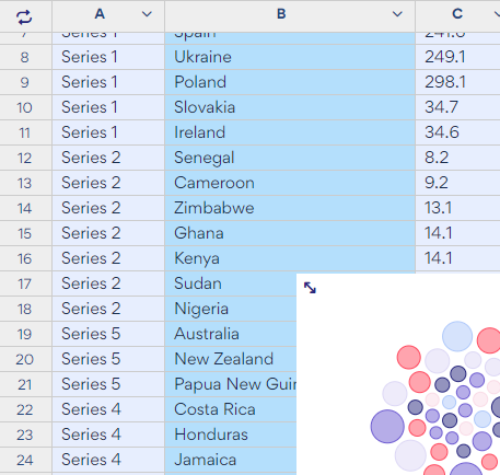
Column A must contain the series, column B, the countries, and column C, the values. To nest multiple countries in a bubble, the countries must be assigned to that series.
Each chart type has sample data. You can view this data and its structure in the data grid in step 2 - data. We recommend using the sample data structure as a guideline when creating your own data structure for each chart type.