Text and annotations
In step four of the wizard, edit main chart elements such as the title and subtitle, and apply text boxes and highlights to bring the viewer's attention to certain areas of the chart.
This panel has two menus with customization options:
- Annotations
- Text
Tip: Check out the editor for more chart customization options.
Annotations
The annotations menu contains three elements:
- Text labels
- Highlights
- Lines
Common functionality for all three:
- Dropdown menu: Used for selecting elements. The menu is useful if creating multiple elements, which are numbered here in the order created
- Plus +: For adding elements to the chart
- Trash can: For deleting elements from the chart
Add a text label
Text labels are small boxes with arrows that are used to explain certain data points such as peaks or dips in the data.
To add a text label:
- Expand the annotations menu
- Click + to highlight the chart preview area
- Click the chart plot area where you want to place the label
- Drag the arrow to its final position
- Add text to the label in the Text field.
Text label options
Change the appearance and size of the text label.
Text: Enter text for the text label
Type: There are three variations of the text label:
- Callout: the label is a black rectangle with with text
- Connector: the label is text only
- Circle: the label is a black circle with white text
Size: Click the up and down arrows in the Size menu to change the label size.
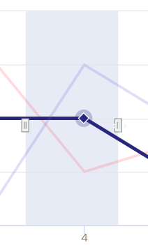
Highlight a section of a chart
Add a highlight to illustrate a phenomenon in the data. Highlights can be converted into a line.
To add a highlight:
- Expand the annotations menu
- Click + to add the highlight
- Drag it to final position and drag the ears to change the width
Highlight options
Change the appearance of the highlight in the Highlight options area. A highlight appears as either a blue column or strip or as a vertical or horizontal line.
- Label: Use the label to describe the phenomenon being highlighted
- Type: The highlight has two variations: Range is a blue column; and Line turns the highlight into a line
- Orientation: The highlight has two orientations, horizontal and vertical. Both can be applied to either a line or range
- Dash style: These options can be applied to the Line highlight
Add a line
A line can be used to illustrate for example revenue targets or a threshold. Lines can be converted to arrows to highlight specific data points or trends in the chart.
To add a line:
- Expand the annotations menu
- Click + to add a line
- Click and drag the line to the desired position
- Click away from the line to set its final position
Line options
Make an arrow and adjust the line width.
- Type: Add an arrow point to one end of the line
- Size: Change the line width
Add text to your chart
The options in the text menu allows you to edit some common chart information. Leaving the fields blank removes them from the chart. Click the pencil icon to expose the rich text editor to access options such as text color and font.
Text options
- Title: Add the chart title
- Subtitle: Add the chart subtitle
- Caption: This text appears below the chart and is often used to describe the chart. Captions are great for providing tips on how the reader should understand the chart
- Source: Which organization created the data. The source appears in the bottom right-hand corner of the chart
- Source link: Link to the organization that created the data
- X-axis: Edit the x-axis label
- Y-axis: Edit the y-axis label
Tip: All these text elements can be edited directly in the chart preview window. Simply click the element to expose the rich text editor.