How to create a gauge chart
Disclaimer: The Gauge template is not fully integrated with the everviz editor, so it's a bit harder to manage than other chart types. Follow the instructions in this chapter to create a Gauge chart in everviz.
In this article:
What is a Gauge and when should you consider it?
Solid gauge charts are a good choice for displaying a single value within a range. They are easy and intuitive to interpret and can be visually compared to other gauges using the same scale. However, if you have a number of data points to compare, then another chart type (such as a column chart or radial bar) might be more appropriate
Here is a sample:
To Create a solid Gauge Click on the Reuse this chart button above. This will load the Gauge into your everviz account. Click Save
Customize the Gauge
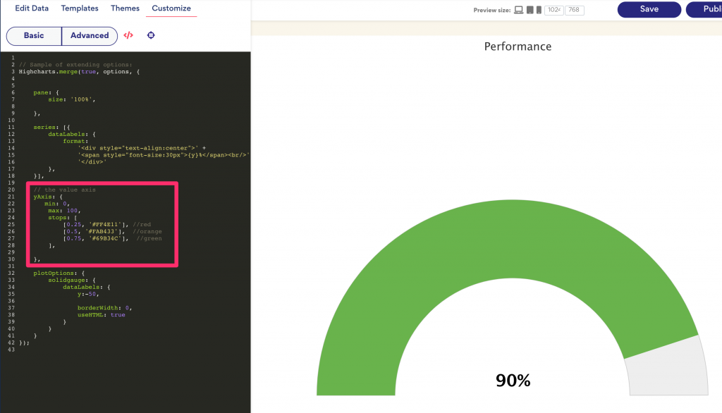
As the Gauge is not fully integrated in our editor yet, customizing the colors and color stops needs to be done using Custom code
1) Open Custom Code editor
Look for the Color stops in the built-in code

Notice where it says
stops: [
  [0.25, '#FF4E11'], //red
  [0.5, '#FAB433'],  //orange
  [0.75, '#69B34C'],  //green
],
This means that the color on the Gauge will vary from Red to orange and green based on the value
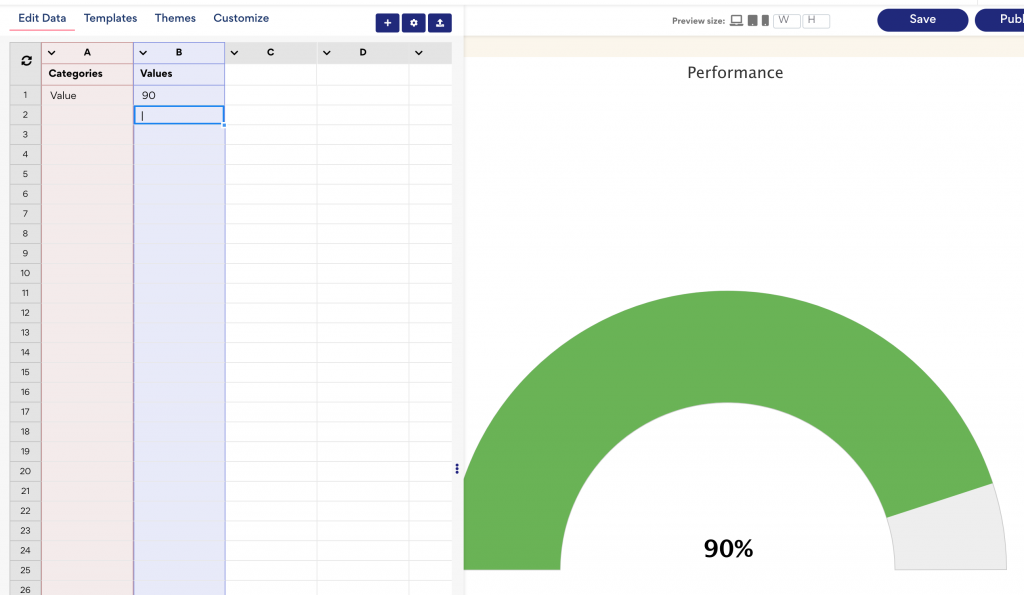
2) Set a value in the Edit data tab
Open the edit data tab to set the desired value for the chart. In our case we have set 90

3) Other customizations based on your desires
Customize texts, styling and all other options you prefer to make the chart look perfect for your page.
